In this blog post we will have a closer look at something called kernel density estimator, KDE. The main purpose of the post is to get an idea of why we would be interested to learn more about this and as usual some simple but illustrative examples.
The histogram?
If someone would send you some data and ask you to make some sense out of it, I would assume that most of you would start by plotting the data. One very common type of plot is the histogram plot. Below an example can be seen where the weight of oranges and grapefruits has been plotted using histogram..
When plotting a diagram like this, we're usually doing some form of density estimation. That is, even when a limited number of data points exists, we are trying to estimate some kind of continuous distribution. In the example above, since a lot of data points exist, it is not that hard to imagine a continuous distribution from the histogram plots.
Why care about KDE?
So why do we need to care about something called KDE? Is there some feature using the histogram that perhaps can be improved? Well, to investigate that, let’s start by looking at how a histogram is constructed. For illustration purposes, let’s write some code that generates data. The code can be seen below.
def make_data(N, f=0.3, rseed=1):
    rand = np.random.RandomState(rseed)
    x = rand.randn(N)
    x[int(f * N):] += 5
    return x
Looking at the code, one would expect the data to be bimodal. Generating 1000 data points and plot a histogram will look something like this:
x = make_data(1000)
plt.hist(x,bins=30,alpha=0.6,density=True)
plt.grid()
plt.show()
And the histogram looks like this:
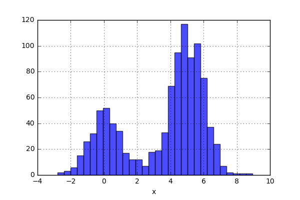
So what has happened here? Well, A histogram is constructed in the following way. A number of bins are created. The bins have a lower and upper limit, and the number of data points within a certain bin are simply counted and plotted. In the case above, we have used the flag “density=True” and this will normalize the data i.e. the total “area” of the bins will sum up to one. This sounds nice, but can this strategy have some drawbacks?
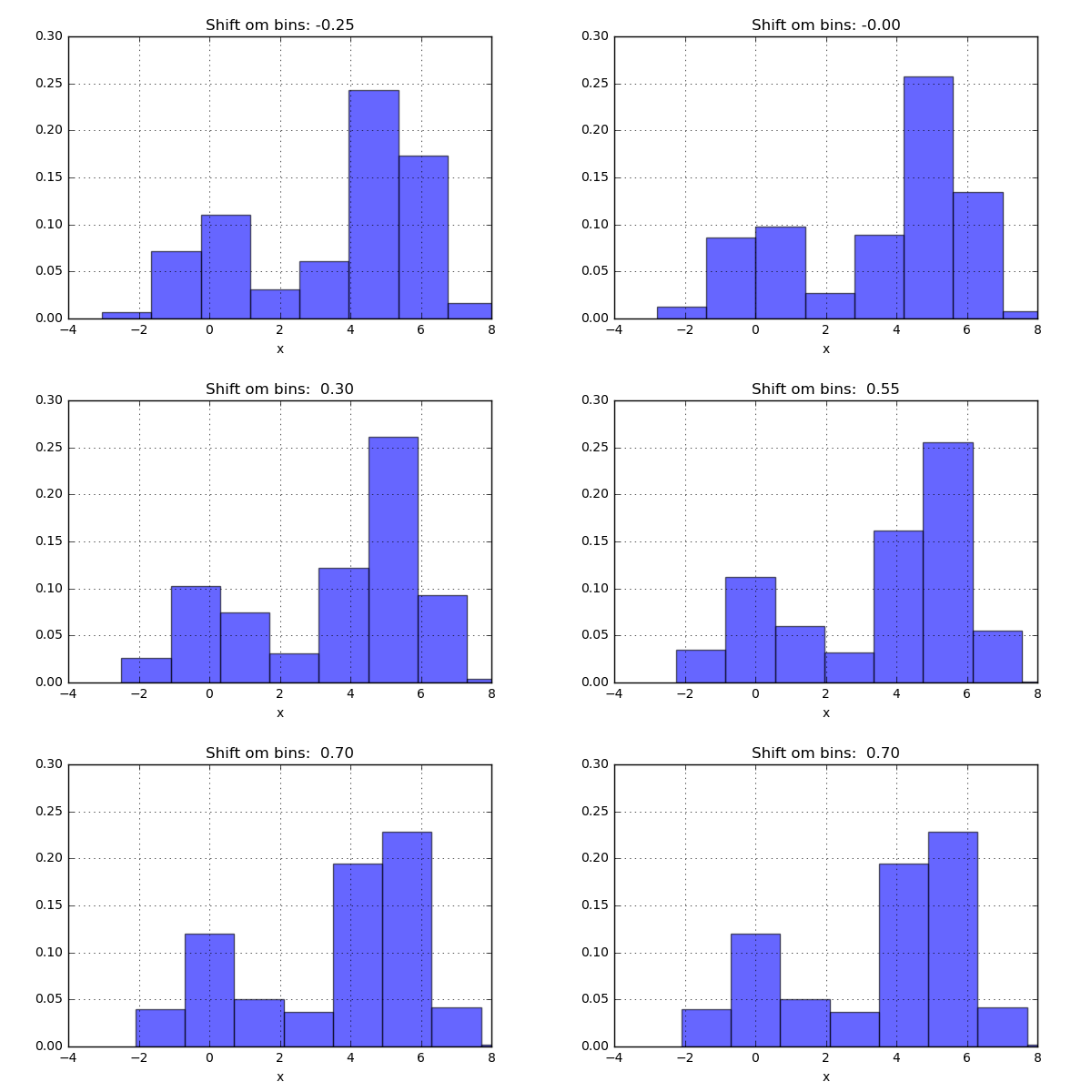
One of the issues with using a histogram as a density estimator is that the choice of bin size and location can lead to representations that have qualitatively different features. For example, if we look at a version of this data with only 20 points, the choice of how to draw the bins can lead to an entirely different interpretation of the data!
On the left, the histogram makes clear that this is a bimodal distribution. On the right, we see a unimodal distribution with a long tail. If I had not seen the code and the data, I would not think that these two histograms come from the same data.
The problem with our two binnings comes from the fact that the height of the bins often reflects not on the actual density of points nearby, but on coincidences of how the bins align with the data points. This mis-alignment between points and their blocks is a potential cause of the poor histogram results seen here. Below a short animation with the same number of bins but with different locations can be seen.
But what if, instead of stacking the blocks aligned with the bins, we were to stack the blocks aligned with the points they represent? Before we test this on the data, let’s try it out on just two data points. Here we align a block around the center of the point and let’s set the width of the box to one. We now simply move the points closer together and when the blocks intersect, simply add them together. The code can be seen below as well as a short animation.
x_d = np.linspace(-4, 10, 1000)
x1, x2 = 2.0, 5.0

for i in range(30):
    x2 -= 0.2

    data = (np.abs(x1-x_d) < 0.5)*1.0 + (np.abs(x2-x_d) < 0.5)*1.0

    plt.plot(x_d,data,'b',lw=2)
    plt.ylim(0,3)
    plt.grid()
    plt.savefig('KDE_'+str(i))
    plt.clf()
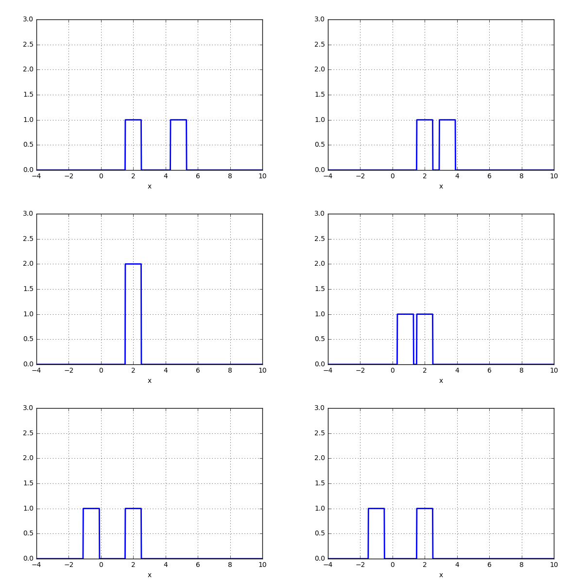
Nice! Not too bad. The blocks were added when an intersection occured. Now for something even more crazy: What if the aligned block no longer was a block, but instead a gaussian kernel? The code would look very similar.
x_d = np.linspace(-4, 10, 1000)
x1, x2 = 2.0, 9.0

for i in range(18):
    x2 -= 0.8

    data = norm(x1,1.0).pdf(x_d) + norm(x2,1.0).pdf(x_d)

    plt.plot(x_d,data,'b',lw=2)
    plt.ylim(0,1)
    plt.grid()
    plt.savefig('KDE_norm_'+str(i))
    plt.clf()
and the result looks something like this:
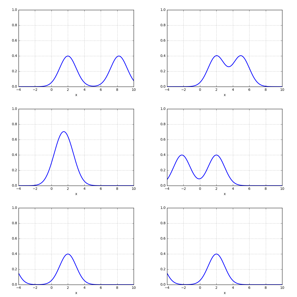
That was pretty sweet! Next thing is to test this on the 20 point dataset that previously was plotted using histogram. Let’s see if the activity of using a gaussian kernel would give a better representation of the actual distribution. Here is some code:
x_d = np.linspace(-4, 10, 1000)
data = np.zeros(len(x_d))

for xi in x:
    data += norm(xi,1.0).pdf(x_d)

plt.fill_between(x_d, data, alpha=0.1)
plt.plot(x_d,data,lw=2)
plt.grid()
and the result looks like this:
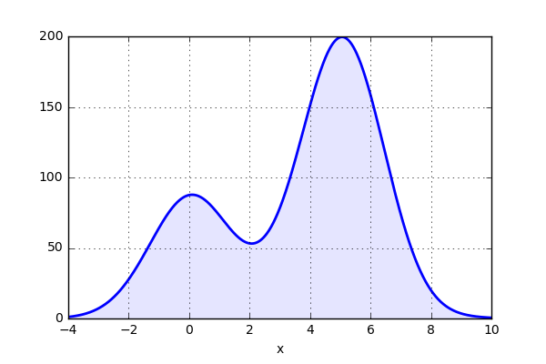
Now this plot actually gives a good representation of the distribution. However, how do we determine the “width” of the kernel distribution, sometimes called bandwidth? We will not go into detail on this, bit save this for a later blog post.
Making KDE work for you!
So far we have looked into what a KDE is and how it is constructed, but can we use it for something useful? Well, one thing this KDE stuff is often used for is for plotting and we will look into one case. The data that we will look at is from oil wells in Norway. The data can be downloaded from npd.no
First of all (as most of the time) the downloaded data needs some additional handling to be easier to work with.
# Load data
well = pd.read_csv('wlbPoint.csv',low_memory=False)
well.dropna(subset = ["wlbPointGeometryWKT"], inplace=True)
well = well.reset_index()

#Extract some coordinated
lats = [float(well['wlbPointGeometryWKT'][i].split()[1][1:]) for i in range(len(well))]
longs = [float(well['wlbPointGeometryWKT'][i].split()[2][:-1]) for i in range(len(well))]

# Create a pandas DataFrame
Well_data = pd.DataFrame()
Well_data['Type'] = well['wlbWellType']
Well_data['Year'] = well['wlbEntryYear']
Well_data['Content'] = well['wlbContent']
Well_data['Lat'] = lats
Well_data['Long'] = longs
Then we can test to plot the data using a standard scatter plot. Here the package "cartopy" is used to create the map. Here we only plot the wells that are dry or contained oil. The code looks like this
# Content dry or oil?
ind1 = Well_data['Content'] == 'DRY'
ind2 = Well_data['Content'] == 'OIL'

# Boundary of map
Lat_val = [0,25]
Long_val = [55,70]

# Plot the map
fig = plt.figure(figsize=(8,15))
ax = fig.add_subplot(1, 1, 1, projection=ccrs.Orthographic(10,60))
ax.set_extent([Lat_val[0], Lat_val[1], Long_val[0], Long_val[1]], crs=ccrs.PlateCarree())
ax.add_feature(cfeature.LAND.with_scale('50m'))
ax.add_feature(cfeature.COASTLINE.with_scale('50m'))
ax.add_feature(cfeature.LAKES, alpha=0.5)
ax.add_feature(cfeature.RIVERS)

# Add some wells
sn.scatterplot(x='Lat',y='Long',data=Well_data[ind1],transform=ccrs.PlateCarree(),color='b')
sn.scatterplot(x='Lat',y='Long',data=Well_data[ind2],transform=ccrs.PlateCarree(),color='tomato')
The plots looks like this:
No to bad. Here we have plotted the dry wells and the ones containing oil. All types of wells are included, so it would be expected that more wells are drilled close to the discovery wells. However, it is not that clear where the well “density” is high or low. To get some idea of the density, let's use the funktion kdeplot in seaborn to generate some plots.
# Get oil data
ind = Well_data['Content'] == 'OIL'

# Boundary of map
Lat_val = [0,25]
Long_val = [55,70]

# Get KDE
kde = KernelDensity(bandwidth=0.015, metric='haversine')
kde.fit(np.radians(latlong))

X, Y = np.meshgrid(np.arange(Lat_val[0],Lat_val[1],0.1),np.arange(Long_val[0],Long_val[1],0.1))
xy = np.vstack([X.ravel(), Y.ravel()]).T
xy = np.radians(xy)

Z = np.exp(kde.score_samples(xy))
Z = Z.reshape(X.shape)

# Plot the map
fig = plt.figure(figsize=(8,15))
ax = fig.add_subplot(1, 1, 1, projection=ccrs.Orthographic(10,60))
ax.set_extent([Lat_val[0], Lat_val[1], Long_val[0], Long_val[1]], crs=ccrs.PlateCarree())
ax.add_feature(cfeature.LAND.with_scale('50m'))
ax.add_feature(cfeature.COASTLINE.with_scale('50m'))
ax.add_feature(cfeature.LAKES, alpha=0.5)
ax.add_feature(cfeature.RIVERS)

# Plot KDE
levels = np.linspace(0, Z.max(), 100)
ax.contourf(X, Y, Z, levels=levels, cmap='Reds',transform=ccrs.PlateCarree())
sn.scatterplot(x='Lat',y='Long',data=Well_data[ind],transform=ccrs.PlateCarree(),color='tomato',s=5)
The plots looks like this:
This looks nice! From the above plot it is clear that there exists some area with higher “density” of wells where oil has been found. The dry wells however, look to be more evenly distributed
Time to conclude
We have now reached the end of this post. Here we had a look at what “problems” can occur when using histogram plots and how this can be solved by instead using kernel density estimator (KDE). After the discussion about what this fancy named estimator is, we also tested to plot some 2D data of oil wells in Norway. The use of a kde-plot gives a graph that is somewhat similar to interpret, when it comes to the well density.
Well, that's all for this time. And as always, please feel free to reach out to us on info@gemello.se.