New blog post, exciting! In this post we will have a closer look at a gaussian process with the aim of simulation thickness variation in a sheet of material.
So what is a gaussian process?
Well, this is a good question and also a good starting point. If you simply google the phrase “Gaussian process” something along the lines below will appear:
In probability theory and statistics, a Gaussian process is a stochastic process (a collection of random variables indexed by time or space), such that every finite collection of those random variables has a multivariate normal distribution, i.e. every finite linear combination of them is normally distributed.
So what does this actually mean? There are a few terms that need some more attention. Let’s start by looking at the multivariate normal distribution. Let’s look at a two dimensional case, i.e. we have two variables (x1 and x2). A multivariate normal distribution can be written as:
\[ X \sim \mathcal{N}(\mu,\,\Sigma) \]
The quantity \(\mu\) tells something about the average values and \( \Sigma \) known as the covariance matrix. The average values are rather simple to have an intuition about but the covariance matrix is a bit tricker. Maybe by starting up a python notebook and playing around with the covariance matrix can bring some clarity to what this quantity actually tells us. Staring with some regular imports that will be used later
import numpy as np
from scipy.stats import norm

import matplotlib.pyplot as plt
import matplotlib as mpl
mpl.style.use('classic')
%matplotlib inline
Luckily for us, the random package included in numpy has a function to generate multivariate normal data. Let's use this function to generate 1000 samples. The code looks something like this
# Data for multivariate data
mu1, mu2 = 0.0, 0.0
S11, S22, S12 = 1.0, 1.0, 0.0
p = np.random.multivariate_normal([mu1,mu2],[[S11,S12],[S12,S22]],1000)

# PDF for normal distridution
x = np.arange(-4,4,0.1)

plt.subplot(223)
plt.plot(p[:,0],p[:,1],'ro')
plt.grid()
plt.xlabel('X1',fontsize=14)
plt.ylabel('X2',fontsize=14)
plt.xlim(-4,4)
plt.ylim(-4,4)

plt.subplot(221)
plt.hist(p[:,0],bins=60,color='r',density=True,alpha=0.5)
plt.grid()
plt.xlim(-4,4)
plt.plot(x,norm.pdf(x),'b',lw=2)


plt.subplot(224)
plt.hist(p[:,1],orientation="horizontal",bins=60,color='r',density=True,alpha=0.5)
plt.grid()
plt.plot(norm.pdf(x),x,'b',lw=2)
plt.ylim(-4,4)
OK, let’s have a look at the result. First run the example with the following values of \(\mu\) and \( \Sigma \)
\[ \mu = (0.0\quad0.0) \]
$$ \Sigma = \begin{pmatrix}1.0 & 0.0\\\ 0.0 & 1.0\end{pmatrix}$$
The graf looks like this
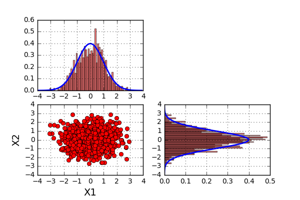
What can we say about the results? Well the first thing to notice is that the data looks to be centered around the point (0,0). This comes as no surprise since the average values (found in \(\mu\)) also have the values (0,0). The second thing to notice is the range of both \(X1\) and \(X2\) seams to be between -3 and 3. A third thing to notice is that the value of \(X2\) does not seem to be influenced by the value of \(X1\). When looking at the histogram plots (representing histogram plots of \(X1\) and \(X2\)), they both look very much like a normal distribution. The blue line added to the histogram represents the pdf of a normal distribution with an average of zero and a standard deviation of 1.
Now let's rerun the code but with slightly different parameters.
\[ \mu = (0.0\quad0.0) \]
$$ \Sigma = \begin{pmatrix}1.0 & 0.8\\\ 0.8 & 1.0\end{pmatrix}$$
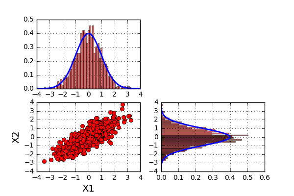
So what can we say about this? Well the first two statements above still looks to be true. However, the last one no longer holds. In this last example, the value of \(X2\) looks to be influenced by the value of \(X1\). A high value of \(X1\) looks to yield a high value of \(X2\). So not completely surprising, the covariance matrix tells us something about the joint variability of two variables.
So now we know a little more about the properties of multivariate normal data, but what can this be used for? Well first we need to expand this to include more random variables than the two we just looked at. When including more dimensions, usually the visualization of data becomes a bit more complicated to let’s try something new. In this following example we will look at an example with four random variables but now plotting them like the schematic graph below.
So what we have done is simply to space the variables equally on the x axis and plot the random value on the y axis. As the dimension of the problem increases, so does the dimensions of \(\mu\) and \(\Sigma\). Let’s try to run two different scenarios when it comes to the \(\Sigma\) matrix
$$ \Sigma_1 = \begin{pmatrix}1.0 & 0.0 & 0.0 & 0.0\\\ 0.0 & 1.0 & 0.0 & 0.0\\\ 0.0 & 0.0 & 1.0 & 0.0\\\ 0.0 & 0.0 & 0.0 & 1.0\end{pmatrix}$$
$$ \Sigma_2 = \begin{pmatrix}1.0 & 0.9 & 0.9 & 0.9\\\ 0.9 & 1.0 & 0.9 & 0.9\\\ 0.9 & 0.9 & 1.0 & 0.9\\\ 0.9 & 0.9 & 0.9 & 1.0\end{pmatrix}$$
As you can imagine, since the covariance between the different random variables are higher in the second case, we will see “less variation” of the data for the second case that for the first. The code below will
n = 4
mu = np.zeros(4)
ss = 0.0
Corr = np.matrix([[1.0,ss,ss,ss],
                  [ss,1.0,ss,ss],
                  [ss,ss,1.0,ss],
                  [ss,ss,ss,1.0]])

X = np.reshape(np.arange(n),(1,n))
p1 = np.random.multivariate_normal(np.zeros(n),Corr,100)
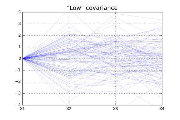
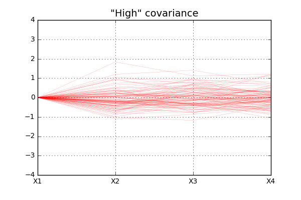
For simplicity all \(X1\) values are in this case set to zero and the data show more “fluctuation” for case of “low” covariance, as expected.
Moving to higher dimensions
So let's do some further development of the concept. What if the covariance between two variables was related to the distance between them? From our intuition, this actually sounds like a realistic scenario, but how do we construct such a covariance? Well, there exists a lot of options but one commonly used is to use a Gausian function for the covariance, i.e.
\[ Corr = e^{-(a*Dist)^2} \]
Plotting this function for different values of the parameter a looks something like this
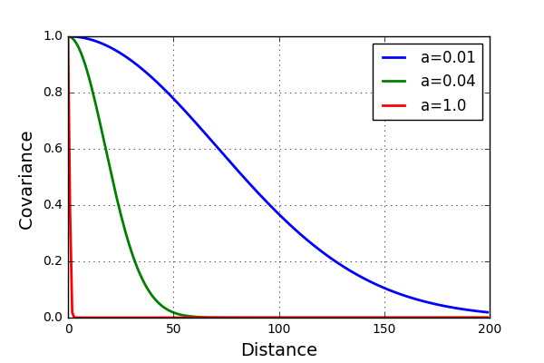
For the blue case (\(a\)=0.01) it is expected to see much less fluctuation of the data than for the red case (\(a\)=1.0). Let’s test this and see if this is the case. Alos, Increase the number of variables to 200.
n = 200
a1 = 0.01
a2 = 0.04
a3 = 1.0

X = np.reshape(np.arange(n),(1,n))

Dist = np.sqrt((X-X.T)**2)

Corr1 = np.exp(-(a1*Dist)**2)
Corr2 = np.exp(-(a2*Dist)**2)
Corr3 = np.exp(-(a3*Dist)**2)

p1 = np.random.multivariate_normal(np.zeros(n),Corr1)
p2 = np.random.multivariate_normal(np.zeros(n),Corr2)
p3 = np.random.multivariate_normal(np.zeros(n),Corr3)
The resulting plots looks like this
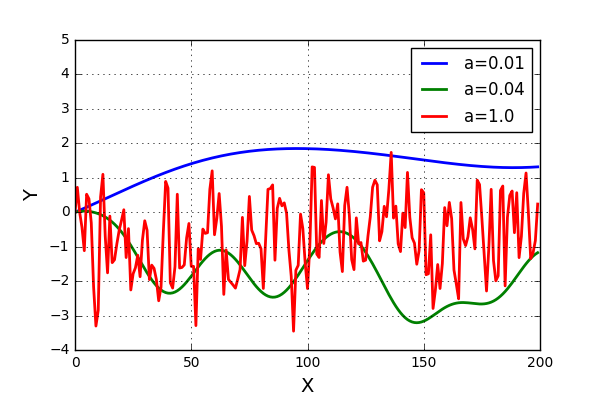
Allright!! This looks really nice! The results are more or less as we expected. And now for the next step, can this be generalized to a surface? Well, yes it can with very small adjustments. Some code can be seen below.
a = 0.3
n1 = 90
n2 = 90
X = []
Y = []
XX = np.zeros((n1*n2,1))
YY = np.zeros((n1*n2,1))

for i in range(0,n1):
    for j in range(0,n2):
        X.append(j)
        Y.append(i)
XX[:,0] = X
YY[:,0] = Y

Dist = np.sqrt((XX-XX.T)**2 + 1.0*(YY-YY.T)**2)
Corr = np.exp(-(a*Dist)**2)

p = np.random.multivariate_normal(np.zeros(n1*n2),Corr)

plt.figure(figsize=(6,6))
plt.scatter(X,Y,c=p,s=80,linewidths=0.0,cmap='magma')
plt.xlim(-0,n1)
plt.ylim(-0,n2)
plt.title('a='+str(a), fontsize=16)
A bit of code, but what is going on here is that instead of simply spacing the variables in one dimension, we space them in two dimensions as a surface. Let’s have a look at the result from the code above.
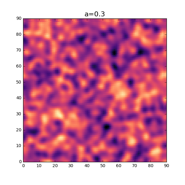
OK, not too bad at all. Without using too much imagination, this looks similar to a distribution of thickness for a thin sheet. As seen in the 1-dimensional case, the parameter \( a \) will influence the amount of fluctuation of the thickness. Let’s try a slightly lower value and see how this will turn out. Reusing the same code as above but changing the value \(a\) will result in the following plot.
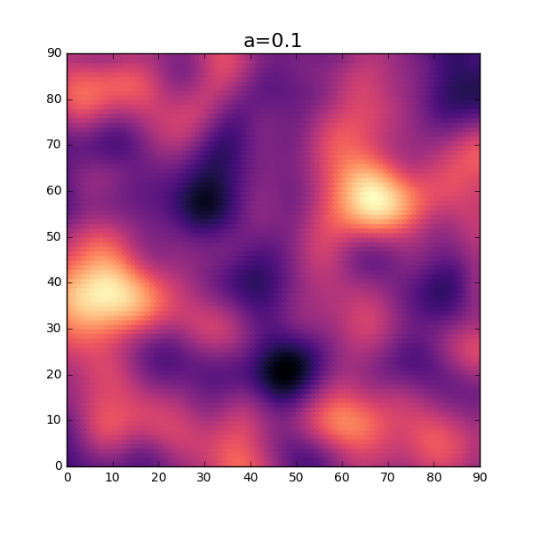
Sweet! As expected, the fluctuation of the thickness is smaller for this setting.
Anisotropic verison
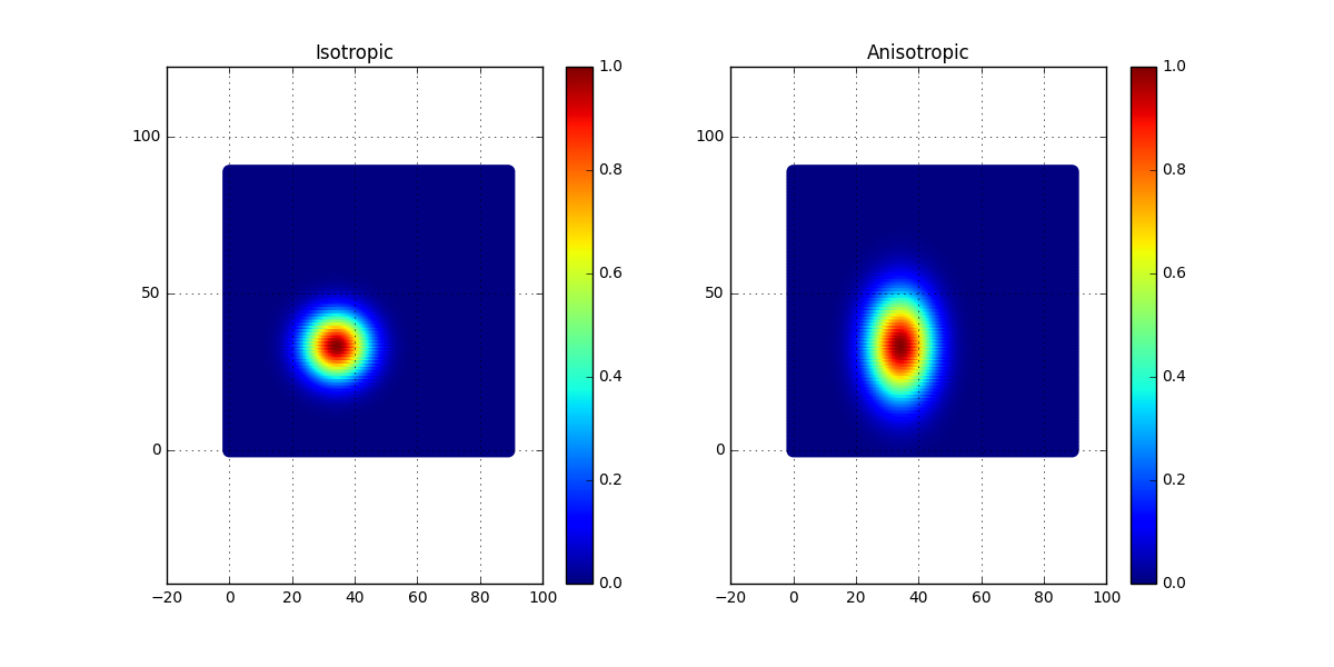
As can be imagined, the thickness distribution can differ depending on a lot of things. One such thing can be the manufacturing process, and the distribution may not be the same in all directions. Is there a “simple” way to include this directional dependency without changing to much in the code? Well, what if we simply change the correlation matrix in some way? A simple way to do this is to put different weights for the x- and y-direction when computing the distance. The code can look a bit like this:
dd1 = np.sqrt((XX-35)**2 + 1.0*(YY-35)**2)
rr1 = np.exp(-(0.1*dd1)**2)

dd2 = np.sqrt((XX-35)**2 + 0.4*(YY-35)**2)
rr2 = np.exp(-(0.1*dd2)**2)

plt.subplot(121)
plt.scatter(X,Y,c=rr1,s=80,linewidths=0.0,cmap='jet')
plt.axis('equal')
plt.colorbar()
plt.grid()
plt.subplot(122)
plt.scatter(X,Y,c=rr2,s=80,linewidths=0.0,cmap='jet')
plt.axis('equal')
plt.colorbar()
plt.grid()
plt.savefig('CorrAnisotropic')
As can be seen, in the second case, a scaling factor has been applied to the y-coordinate. This will result in an anisotropic case of the correlation matrix. In the figure below, the correlation is plotted for the two cases, the isotropic to the left and the anisotropic to the right.
Now simply apply this change to the generation of surfaces and see what happens. The expectation is that there will be less fluctuation in the y-direction compared to the x-direction. Let’s see if this is the case?
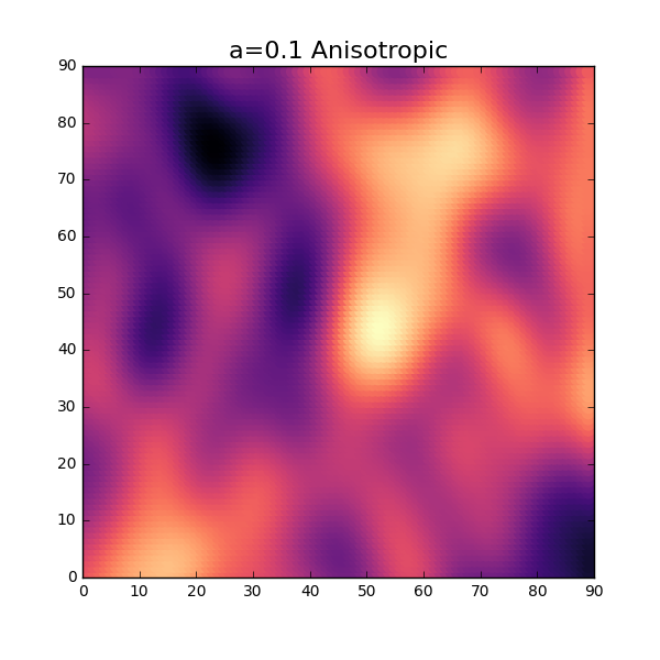
Not too bad at all! Our expectation on the surface after introducing the anisotropic modification looks to be right.
Time to conclude
In this blog post we have had a look at a Gausian process and how this can be used to generate data that represent the thickness variation of a two dimensional surface. Also some modifications that make it possible to handle anisotropy were discussed. This can be done using quite small amounts of coding.
Well I guess that was all for this time and, as always, feel free to contact us at info@gemello.se